Vol.2
[Duotone photos]

Rice写真館へ戻る
[Back]

なんの写真かわかるかな?
トイレの便座です。下から見上げるように撮ったのでなかなか面白い構図になりました。

What do you understand it?
Its a toilet seat. I took this seat from below, so its composition seems interesting.


左から右に行く人と奥から手前に向かう人が、構図に奥行きを持たせていて、横断歩道と左上の人が写真に緊張を与えている。今回のベスト。この図になるまで待ってたからなかなか時間が掛かった。

The person walking from the left to the right and the parson are coming are making good composition in the photograph. The line on the road and the parson on the left middle also make tention in the photo. It is the best photo in this critic. It took a long time to wait here to take it.


この写真は気に入っているんだけど、あまり周囲での評判は良くなかった(^^;)。

I like this photograhs; nevertheless, it was not said a lot in the critics. [It meant that it is so so?]


ちょっと色がうるさすぎる。黄色とオレンジは避けた方がいいという好例。もしくは、もっと暗い色にするとかね。

This color is too bright. Yellow and Orange should not be combine. Or these should be more darker to use in the photo.


水色と赤の対比が強い。なんか、イメージ的に少し昔の宣伝みたいな感じがする。

The strong combination of Bule and Red. This image looks like the advertisement a decade ago.


力強い紫色で、色の感じはかなり気に入っている。ミュージッククリップ調。

The great purple. I like its color. It seems like music clip scene.


構図は狙って見たんだけど、あんまり面白くない写真になっちゃったね。

I tried to take good composition, but it does not succeed.


メモ[Memo]

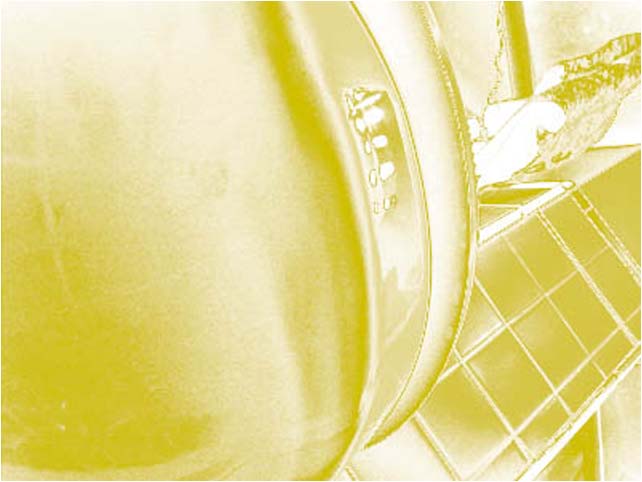
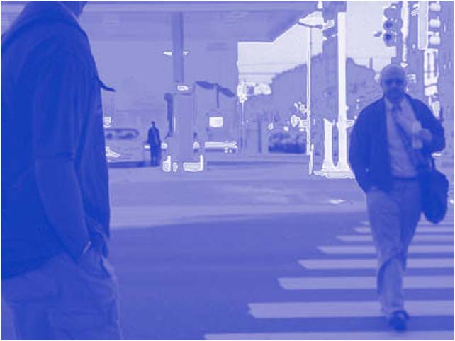
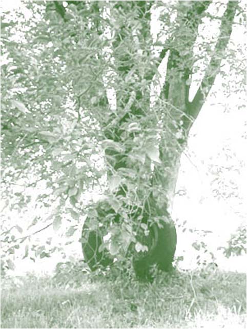
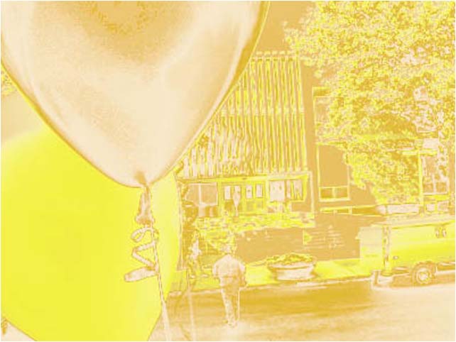
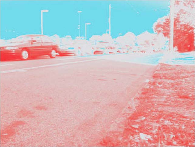
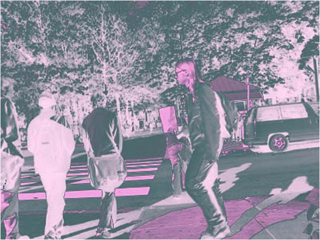
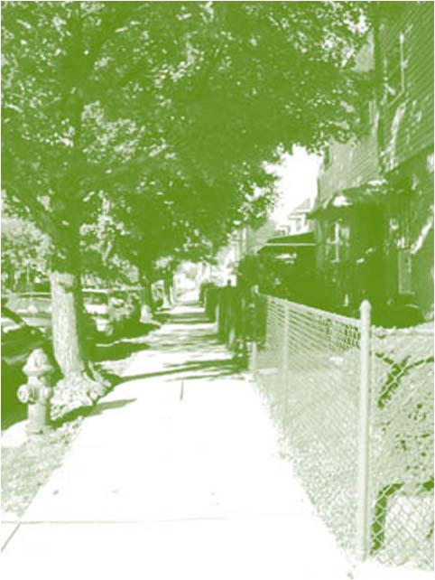
多色刷写真(Duotoneって何ていうの?)は、黒を強めにしながら色を加える感じの方がいい。今回の写真は、どれも黒が殆ど無い。また、複数の色を組み合わせる時は、色の組み合わせを良く考える事が必要。

When you take duotone photographs, you should think about black and other color. Photographs in this critices have only few black color. And, if you combine colors, think about effective of color combination.


Rice写真館へ戻る
[Back]